All data collected as of April 16th, 2010
NASA - Global Climate Change Key Indicators
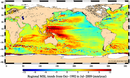
Sea Level :
Sea level change is not uniform, red areas show highest levels of change. Variation is due to minute variations in the earth's gravity forces due to uneven mass.
Arctic Sea Ice :

Arctic sea ice is now declining at a rate of 11.2 percent per decade, relative to the 1979 to 2000 average.
Arctic sea ice reaches its minimum extent each September. The graph on the left charts the average September extent from 1979 to 2009, derived from satellite observations. The illustration on the right shows the Arctic sea ice minimum extent for 2009, which was the third-lowest in the satellite record.
[ sources : http://climate.nasa.gov/keyIndicators/ ; http://www.aviso.oceanobs.com/en/news/ocean-indicators/mean-sea-level/ ; http://nsidc.org/ ]
Antarctic Warming Confirmed
(1)
(3)
(4)
(1) a, Calibration r, 1982–1994.5; b, calibration r, 1994.5–2006; c, verification r, 1994.5–2006; d, verification r, 1982–1994.5; e, verification RE, 1994.5–2006; f, verification RE, 1982–1994.5. Warm colors in e and f (RE scores greater than zero) show where results are more accurate than the climatological mean temperature. Mean grid-point verification results are RE = 0.11, CE = 0.09 and r = 0.46. Crosses show locations of occupied weather stations.
(2) a, East Antarctica; b, West Antarctica. Solid black lines show results from reconstruction using infrared satellite data, averaged over all grid points for each region. Dashed lines show the average of reconstructed AWS data in each region. Straight red lines show average trends of the TIR reconstruction. Verification results for the continental mean of the TIR reconstruction are RE = 0.34, CE = 0.31 and r = 0.73. Grey shading, 95% confidence limits.
(3) a, Mean annual trends for 1957–2006; b, Mean annual trends for 1969–2000, to facilitate comparison with ref. 2. c–f, Seasonal trends for 1957–2006: winter (June, July, August; c); spring (September, October, November; d); summer (December, January, February; e); autumn (March, April, May; f). Black lines enclose those areas that have statistically significant trends at 95% confidence (two-tailed t-test). Where it would otherwise be unclear, NS (not significant) refers to areas of insignificant trends. Red circles and adjacent numbers in a show the locations of the South Pole and Vostok weather stations and their respective trends (degrees Celsius per decade) during the same time interval as the reconstruction (1957–2006). Black circles in b show the locations of Siple and Byrd Stations, and the adjacent numbers show their respective trends13 for 1979–1997.
(4) a–d, 1957–1981; e–h, 1979–2003. a, e, Reconstructed surface temperature and observed 25-year change in sea-ice fractional area23. b, f, Surface air temperature from five-member GISS ModelE atmosphere-only ensemble simulations with observed sea-surface-temperature and sea-ice boundary conditions. c, g, Four-member ensemble with the same boundary conditions plus atmospheric forcings (changes in atmospheric concentrations of radiatively active species, including ozone). d, h, Difference between simulations with the same forcings but observed versus climatological sea ice, to isolate the effect of sea ice alone.
Synopsis :
Due to changes in the ozone layer over Antartica, some localized cooling was measured in parts of Antartica as the ozone layer responded positively to significant reductions in CFC pollution. A significant re-evaluation of all data since 1957 has been performed and is presented here in these charts. Scientists had long thought that while some isolated parts of Antarctica had been warming, much of the continent had been cooling over the past 50 years. This new analysis found that since 1957, when measured as a whole, the continent’s temperature has risen about 1 degree Fahrenheit.
Researchers used data from satellites and automated weather stations to compile the most comprehensive picture ever of the Antarctic climate over the past 50 years, and published the results in Nature [see "sources" below ]. While East Antarctica has shown little change and has cooled slightly in some patches, West Antarctica, has long evidenced a strong warming trend. The Antarctic Peninsula, warmer than everywhere else in the western region, is where we have been witness in recent years to massive ice shelves collapsing into the sea as temperatures rise above the melting point.
In fact, a major ice shelf is poised to break away from the continent at any moment and most likely will do so in the next couple of months.
A one degree warming in fifty years does not sound incredible, but even a 2 degree overall global change is incredibly significant - but this is a story for another article..
[ sources : http://www.nature.com/nature/journal/v457/n7228/fig_tab/nature07669_ft.html ; http://www.nature.com/nature/journal/v457/n7228/full/nature07669.html ; http://blogs.discovermagazine.com/80beats/2009/01/22/antarctica-is-definitely-feeling-the-heat-from-global-warming/ ]
** This post is a work-in-progress, additional data and commentary will be added over the weekend **


No comments:
Post a Comment
Please also join our facebook group at http://www.facebook.com/?ref=home#!/group.php?gid=111271878911510 to meet with other readers of this blog interested in climate change.